Hops of Horror and Heavy Metal: crafting a micro brewery brand.
METALHEAD
Remote
2023
Role
Art Direction
Design
Branding
Illustration
Team
Gret Kostadinova
Product photography
Mara Radeva
Remy Chaloner
DJ Riaz
Team
Gret Kostadinova
Product photography
Mara Radeva
Remy Chaloner
DJ Riaz
Team
Gret Kostadinova
Product photography Mara Radeva
Remy Chaloner
DJ Riaz
Team
Gret Kostadinova
Product photography
Mara Radeva
Remy Chaloner
DJ Riaz
Team
Gret Kostadinova
Product photography Mara Radeva
Remy Chaloner
DJ Riaz
METALHEAD is a small independent craft beer brewery in need of a fresh rebrand to ensure consistency and enhance recognition. The rebrand aimed to convey that METALHEAD is no longer a hobbyist, garage-brewed operation but a professionally run brewery with deep roots in the local culture.
When developing the creative direction, I focused on the two main brand pillars: Artisanal Craftsmanship and brewery's affection for Metal music.

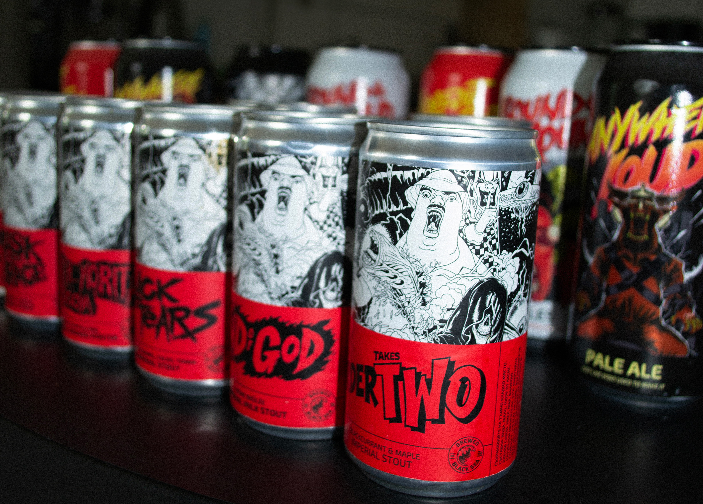
We looked for inspiration in vintage horror and grindhouse movie posters. The usage of bold and expressive hand-crafted lettering, centric composition around a main character, and a limited palette of bold colors characterizes the overall creative direction.


For the three most-popular core brews, I created an ironic and over-the-top key artwork, inspired by classic metal and horror vignettes. As part of the collaboration process with the client, we went through rounds of sketches, trying to capture best the story behind each brew in a way that is appealing to younger demographics and also reflective of its taste and ingredients.



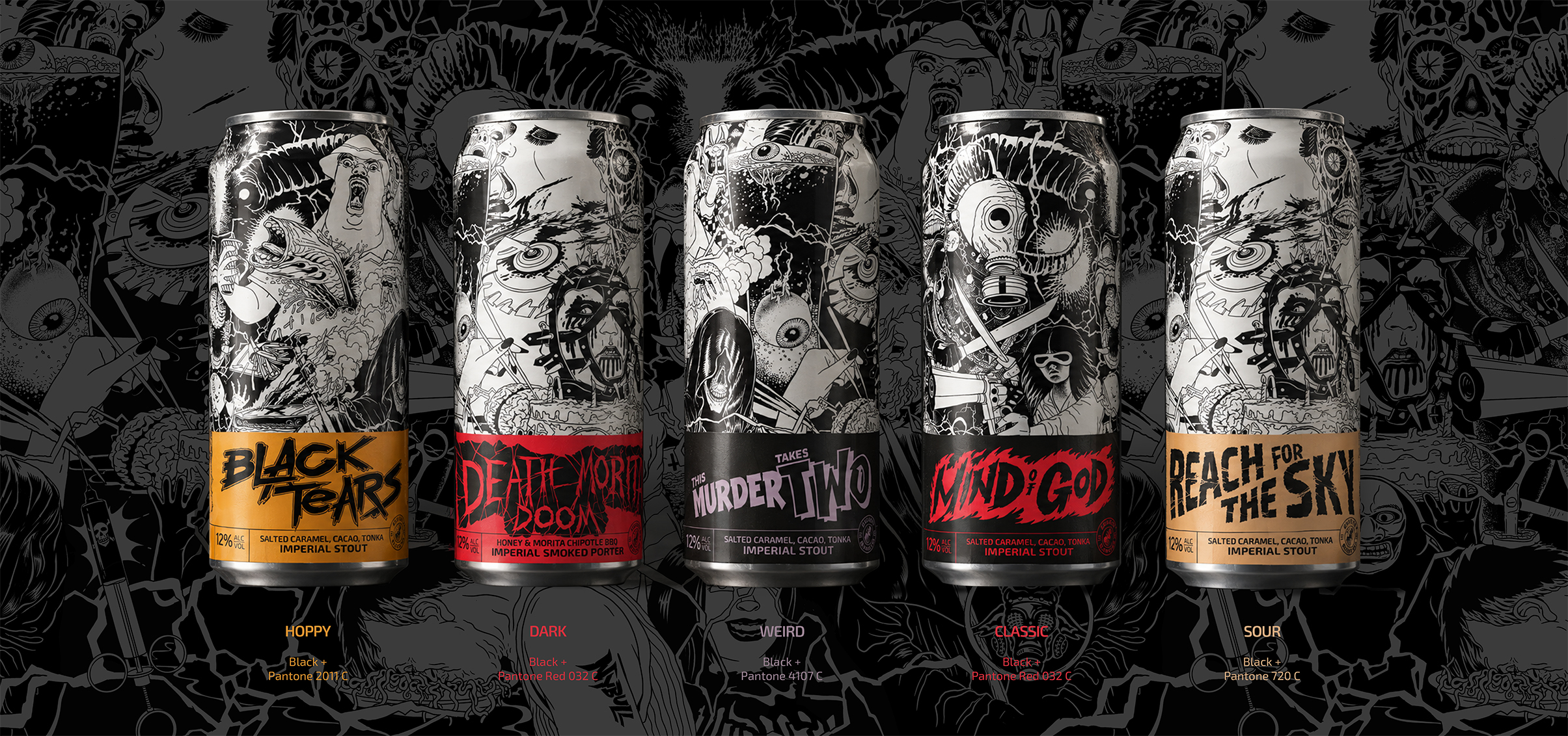
We continued with the same approach for the branding of the seasonal, "non-core" brews - smaller batches with a quick turn-around. I produced a full-bleed key artwork carrying same stylistic reference, layered with a colorful bands on top. We introduced color-coding for each product category and produced a hand lettered logo for each brew.